Overview
The Objectives Chart page displays a variety of charts for objectives and sub-objectives. It displays the same impacts as in the Objectives Grid.
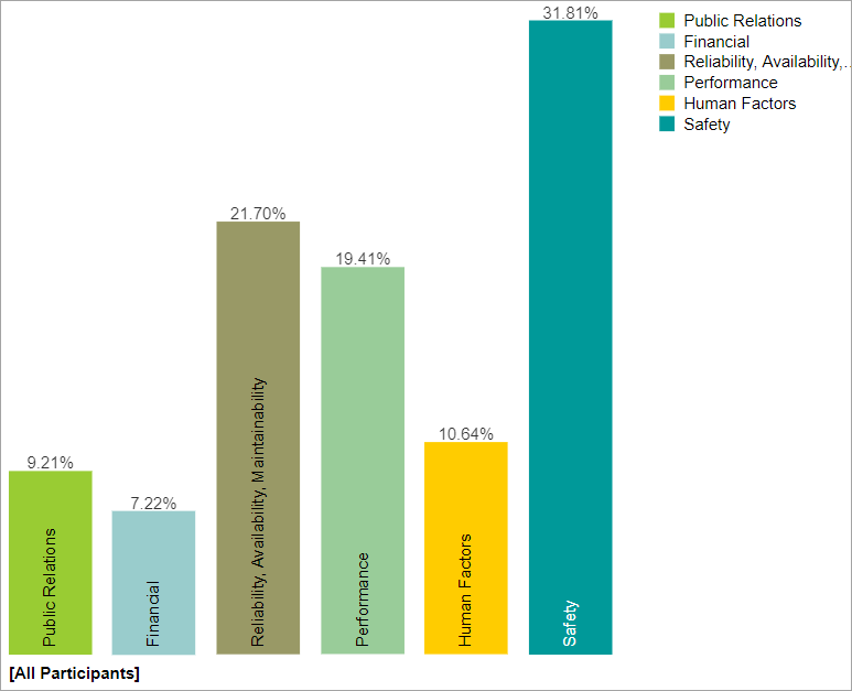
By default, the Columns chart is displayed. The column chart below shows the sources' impacts due to the overall Objective.
You can view other different chart formats when the Advanced-mode is enabled.
 Column Charts for the Overall Objectives Impacts
Clicking another objective node on the Objectives hierarchy at the left will show the chart for the objectives due to that node.

Above, we can see the column chat for the Objectives impacts for nodes below "Public Relations".
You can select one or more participants or groups by clicking 
If more than one chart is available, pagination is displayed at the bottom of the page:

- Charts per page (left) - select how many charts to display per page
- Pagination (right) - paginate or select the page to display
Non-advanced Mode options (Rotate, Legend, Sort, etc.)
Various options are displayed on the toolbar at the top of the charts. Depending on a chart type, options may only be available only a specific chart type.
- Rotate - turn on/off rotate chart by 90 degrees (this is ON by default)
- Legend - show or hide the Legend

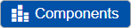
- Components - Show or hide objectives components.
- Sort - sort chart by impacts, name, or none (default: none)
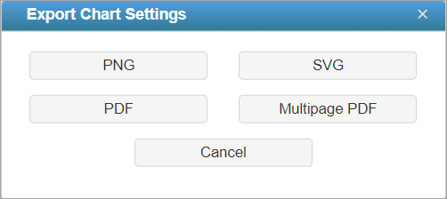
- Export - export as png, svg, pdf or multiple pdf

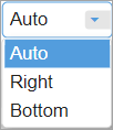
- Legend Position - can be auto, right, or bottom of the chart (default: Auto). Legend position is only enabled when the Legend is displayed.
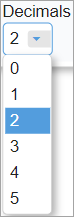
- Decimals


TIP: All chart types have the same common options as above for non-advanced mode -- except for Components which is only available for Columns.
HINT: For smaller screens, some of the options may be hidden. You may see the hidden options by clicking the ellipses  icon at the top right.
Chart with Components
You can show the column charts with components by toggling the  button.
Objectives Charts with Components show the impacts of each source divided into sections showing how much of the impact is due to each of the objectives.

Hovering on a specific component will highlight that element for all the objective bars, a tooltip will also be displayed to see its details -- ([Participant or Group Name]: %Impact Objective Name).
Advanced Mode Options
When Advanced mode is ON, you will see the advanced options on this page (see highlighted):

1. Chart Types
More chart formats are available in the advanced mode.

The Columns chart is selected by default, you can select from other chart types available. The selected chart format on the advanced mode will be remembered when you switched back to the non-advanced mode.
2. Grid View (Multiple Rows or Single Row)
This option is available for all chart types except for Stack when more than one participant/group is displayed. This allows you to display the charts in grid view (multiple rows) when ON, or a single row when OFF.
3. Labels
Show or hide chart labels or the objective names on the chart. This will only show the % impact on the chart. You can then show the legend instead. 
4. Local Likelihoods
Toggle between local impacts (blue button) or global impacts (grey button) 
5. Group by Users
Available for Columns chart when multiple users/groups are selected. By default, this is option is ON, so the chart is grouped by Users. When this is OFF, the chart will be group by elements or nodes.

6. Combined Input Option (CIS)
If the Combined Input Option (CIS) is on (see below) then results for individuals are computed by combining the impacts derived from judgments/ratings for which they had roles, with the combined results for any parts of the model where they did not have a role.

7. Apply User Priorities
If priorities (weights) have been specified for participants, you can use the "User Priorities" check box will enable you to apply or ignore these priorities in generating the results.

8. Font Size
Decrease or increase the font size, or reset

Advanced Mode Charts
When the Advanced Mode is ON, the Chart Type dropdown is available:

Hierarchical Pie Chart
A hierarchical pie chart is a visual representation of the hierarchy of Objectives. This is available when Auto-advanced is ON.
The center circle pertains to the Overall Objective.
The first layer segments are the first-level children of the hierarchy -- the "Human Factor", "Environmental" and so on...
The second layer segments are the children of the first-level nodes which have a lighter shade color of their parent.
In the example below, the "Human Factor" source has children: "Engineers Failure to Properly Install Equipment", "Lack of Situational Awareness"...

When the Advanced mode is ON, we can check/uncheck the  checkbox.
The chart above has the Area Mode is ON, that is, the sum of the children's segments area is equal to their parent's area.
When the Area Mode is OFF, all the segments will have the same height as shown below:

Turning ON the Rotate button rotates the chart by 45deg clockwise, turning it OFF will just revert it back (45deg counterclockwise). 
You can also rotate the chart by smaller degrees both clockwise and counterclockwise using the left/right arrows. The left/right arrow buttons are only available on Advanced mode.
You can also rotate the chart by smaller degrees both clockwise and counterclockwise using the left/right arrows. The left/right arrow buttons are only available on Advanced mode.
TIP: If in case some of the labels are being blocked by the toolbar at the top, the rotate option will be helpful.
You can click on a parent node on the chat or from the legend to focus on a flex:
Clicking the same node will return to the overall chart.

Pie

Donut

Stack

