Overview
This page displays the same diagram as with the Risk Map From Sources (without controls) -- with additional options to show the Risk Map when controls are in effect.
In Riskion, we refer to threats, causes, hazards, and sources interchangeably. While they may have slightly different nuances depending on the context in which they are used, they serve the same purpose -- they are all threats/sources of risk (for Risk Events) or sources of opportunity (for Opportunity Events). In our sample model, we are using the terminology "Source(s)".
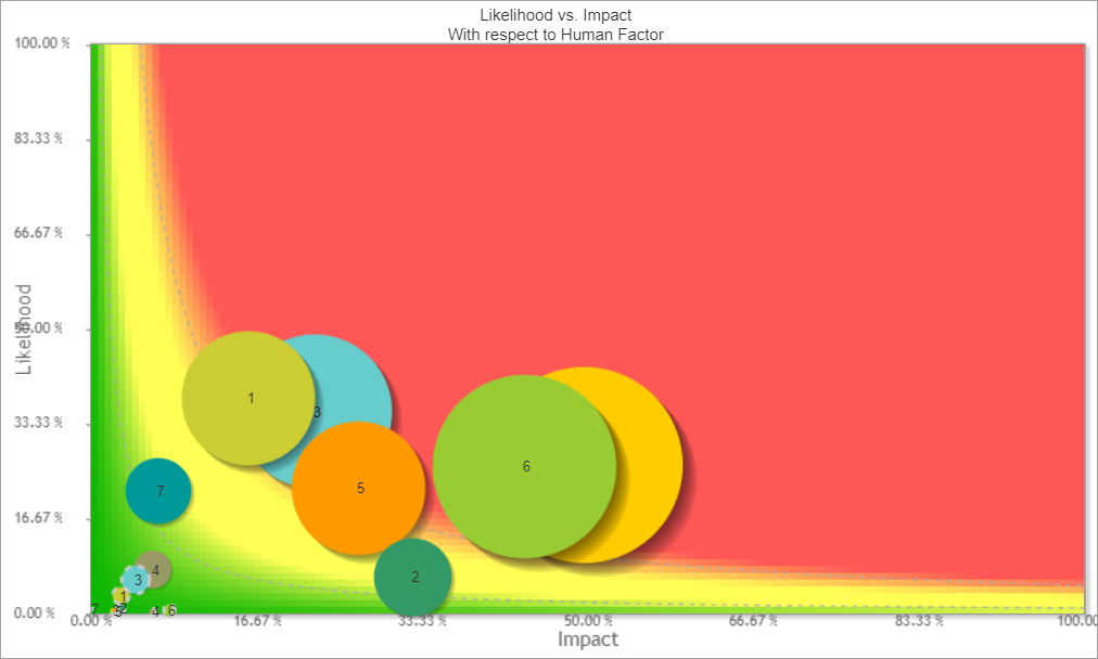
Here we see the Risk Map for the Likelihoods, Impacts, and Risks of the events from Source "Human Factor" with and without controls.
 Risk Map for Events Likelihoods, Impacts and Risks from Source "Human Factor" with controls
A source is selected from the Sources Hierarchy at the left.

You can also select the top node "Overall" which will show the same results as with the Overall Risk Map with controls page.
The X-axis represents the likelihood of events, and the Y-axis represents the impact of events (Note: You can interchange the axes from the Preferences)
The bubbles represent the Events. By default, the size of the bubble is proportional to the risk of the event. The biggest bubble size represents the largest risk and the smallest bubble size represents the smallest risk. All values in between are sized proportionally in relation to the highest and lowest risk values. You can make all the bubble size the same by unchecking 
Each event has unique bubble color which doesn't have any meaning. You can choose to color the bubbles based on Event Attributes.
Riskion provides the default risk map color based on the risk region. Red represents high-risk, green represents low-risk, yellow represents in between. You can modify the risk region color.
 Risk Map From "Human Factor" split view
Notice how the size of the event bubbles and the plotting on the x and y-axis changed. The Likelihoods, Impacts, and Risks are reduced when the controls are in effect.
Hovering over an Event bubble will show the likelihood, impact, and risk of the event on a tooltip -- Additionally, it will highlight the corresponding risk region and the likelihood, impact, and risk of the hovered event on the grid at the right.
For the event "Line Closure" without control -- its likelihood, impact, and risk are 35.40% 22.54% 7.98% respectively -- the bubble is in the red or high-risk region as shown below:

When controls are in effect, the likelihood, impact, and risk of the same event are reduced to 5.84% 4.50% 0.26% respectively -- the event bubble is now in the green or low-risk region.

Clicking the Event name on the grid will redirect you to the corresponding bow-tie diagram from that event.
Other risk map views are available from the radio button at the top:

- Without control -- same as with the Risk Map From Sources (without controls)
- With control -- displays one risk map for mitigated events' likelihoods, impacts, and risks (with controls)
- Both - split -- 2 risk maps, one for without controls and another for with controls (as shown from our example above)
- Both - combined - one risk map showing the events both for without and with controls
 Combined Risk Map From Source "Human Factor"

The events bubbles with controls have a dashed outline.
Select Participant and Group
The results for the "All Participants" group are displayed by default as shown above.
By selecting from the participants and groups menu, you can also see the risk map for an individual participant or a group.

Risk Map Region
Default colors are already provided for the risk map region.
You can change this by clicking 

Here you can specify the limits: Rh (risk high) and Rl (risk low) both for percentage or monetary.
Given the limits, you can specify the 3 regions/colors:
- High Risk
- Mid (in-between) Risk
- Low Risk
The color specified here is used on the Event's color on the bow-tie diagram.
Risk Map with Event Attributes
When Event Attributes are defined in the model, additional options are available on the toolbar.

Here you can filter, color, and use shapes other than bubble based on the event attributes.
- Filter by Attributes - checking this option will filter the events on the risk map based on the conditions specified. You need to click
 to define the conditional statement for the attributes.
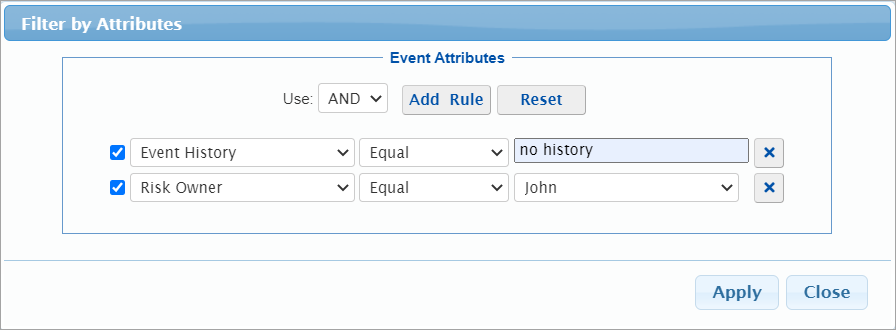
- Color Bubbles by Category - checking this allows you to select an event attribute in the dropdown. Selecting a category will have the event of the same attribute to have the same color.
- Marker Shapes by Category - similar to Color bubbles by category, but this option will have the events of the same attribute to have the same shape (instead of a bubble).
 to define the conditional statement for the attributes.
Show Monetary Values

You can show the Monetary Values for Impacts and Risks.
Clicking  will open a modal where you can specify the monetary values.

Simulated vs Computed Event Likelihoods, Impacts, and Risks (Flaw of Averages)
The risk of an event is the product of the event's likelihood and impact. However, the computed likelihood of an event may depend on the event being caused by more than one threat. If these threats are not mutually exclusive, then the computed likelihood, based on the occurrence of the event from several can exceed the actual likelihood. If in the real world an event takes place due to one threat, it is irrelevant that it would have also occurred due to another threat had the first one not caused the event. This 'if' condition is a non-linearity in computation. To arrive at the actual likelihood of an event, we can use simulations that will avoid the 'double counting'.
Similarly, an objective that suffers consequences from one event, may also suffer consequences from other events. The consequences can be cumulative but they cannot exceed the entire value of the objective so that this is another non-linearity that can be addressed with simulation.
Riskion has an option to show simulated and computed results.
Simulated results are displayed by default; unchecking the Simulated checkbox displays the calculated results.

If all events have at most one threat, or all threats are mutually exclusive, then the computed and simulated event likelihoods will be the same -- but this is rarely the case.
If each objective has losses due to only one event, then the computed and simulated impacts will be the same -- but this is rarely the case.
Preferences
Click the  button to open the display and simulation settings modal.

- Events Numbers - select from ID, Inder, or Rank
- Display Settings
- Consequences simulation mode: Diluted or Undiluted
- WRT calculation (applicable only when a lower node is selected)
- Show Total Risk - show hide the Total Risk below the grid for Diluted
- Decimals
- Show cents of Monetary Values
- Simulation Settings
- Number of trials
- Seed
- Keep Seed
- User Source Groups
- User Event Groups
